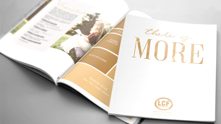
“Less is more” is a very popular and well known statement that speaks to having balance in design. For LCF, it was also the theme of their yearly magazine.
The look of the More magazine was very clean and uncomplicated. With accents of gold to finish off the very stylish look. As usual, we present different looks to choose from based on the design brief. The client chooses their favorite option and we pull that through on each page.
Each page was custom designed, based on the theme and was matched to the info on the page. The effects on the photos also match the elegant theme, while also bringing depth into the design.
The design of the magazine is a very important task, as it sets the tone of the whole year and speaks to the vision they have for the church for that year. It’s a great honor to design the LCF magazine and we don’t take it up lightly.
Do you have a design in mind that needs special attention and care? Give us a call and lets chat about what your needs are.


