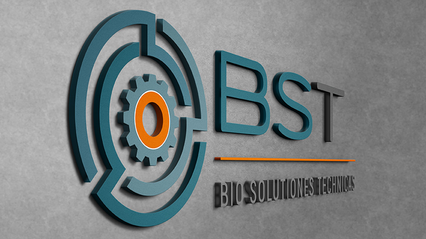
Have you paid attention to how unique a logo can be and how much different logos can differ from one another? Well, that helps illustrate how different the personality of that business is from others. This is what we do, we create and establish unique branding for our clients, to express their personality as a business.
The logo we designed for Bio Solutions Technicas is the result of a “tried and tested” process of “brief and design”. The more detailed a client briefs us on what their needs are for their project, the better we are equipped to implement it in design.
Based on their brief (branding questionnaire) we know that the brand, and essentially the logo, needed to be different and not predictable. That is why we brought in an icon to compliment the name. The icon can also be used separately on marketing material in a variety of ways. The use of solid colours also helps keep the logo versatile and limitless.
The thin lines in the logos speak of style and precision work while the font indicates professionalism and attention to detail. The overall clean look shows that they look at finer detail and not only at the first thing they see.
We like to get a better picture of who our clients are, what their business is about and what is important to not only them but also their clients, to give us perspective on their projects.
If you’re looking for a personal relationship with your designer and a personal touch in the work they do for you, give us a call.


