Stylish and professional. Elegant and strong. What do all these words have in common? A very exceptional logo. Stylish, professional, elegant, strong sophisticated etc. these are all words we use to get to a point of forming ideas. This is just one of the fields on our creative design brief that helps guide us to the point of design and get the creative juices flowing.
Our brief is structured in such a way that we need to ask as little as possible additional questions. This also helps us make more accurate designs for our clients.
Bokamoso in Motion needed to bring a more stylish look into their branding to represent their female owned business, but also what they do. Having a transport business is already a challenging thing, so branding doesn’t have to form part of this challenge.
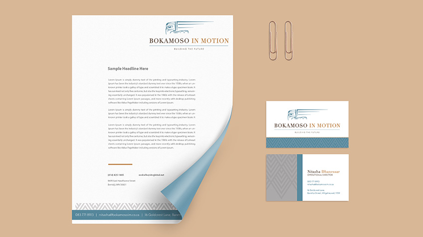
The brand colours used are shades of blue and brown that gives a true, African feeling and speaks of heritage. The icon needed to represent motion, while the name needed to stand firm and string in the logo, just as they stand firm and strong in their industry.
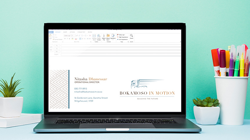
The general feeling of the corporate identity is clean and professional, so we tried not to use too many design elements that would make it feel cluttered. Their business card, email signature and letterhead, all form a key part of their essential brand startup designs. These elements help you with most aspects of a new and established businesses branding.
With their brand established, this dynamic company can now continue with any marketing designs in the future having faith in the result we will create.
Do you have faith in the skills of your design company?


