Something that stands out and represents our business. Something clean and professional, but not boring. Have you ever thought about how these words are turned into a design? Our years of design experience gives us the ability to interpret the client’s brief and our helping hearts guide us in understanding what they actually mean.
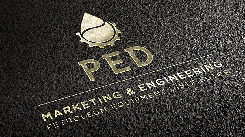
By using the design brief given to us, we started designing different options for PED Marketing and Engineering’s logo first. The logo sets the tone for the rest of the CI. We used strong bold colours, namely black and red. The typeface we used, was bold and the general look was clean.
We played around with the icon to help represent their services. From there, we moved on to the business card; bringing through the feeling of quality and high standard of service. We also applied it to the different contact persons details so they could just have it printed.
The business card was kept “clutter free” to continue the neat look established with the logo and because the logo is such a focal point, we didn’t want to remove from it.
Whatever the size of your corporate identity and whatever your business might be, we have the skills, experience and the heart to help you through this journey of brand discovery.
Just give us a call to get started.


